 Recommended for you
Homeowners often pour their energy into interiors, giving far less thought to the color of their front door. But overlooking this detail can be a pricey mistake, especially if you want your home to feel classy and elegant from the very first glance.
Your home’s exterior sets the tone. Much like the wall art you hang or the objects you display inside, a front door quietly signals your style, taste and attention to detail before anyone ever steps inside.
Whether your aesthetic leans warm and welcoming or refined and sophisticated, you want to make a strong first impression. Unfortunately, certain front door colors can instantly ruin your home’s overall curb appeal.
Here are all the door colors you’ll seriously want to avoid, according to home designers.
Here are 5 outdated front door paint colors.
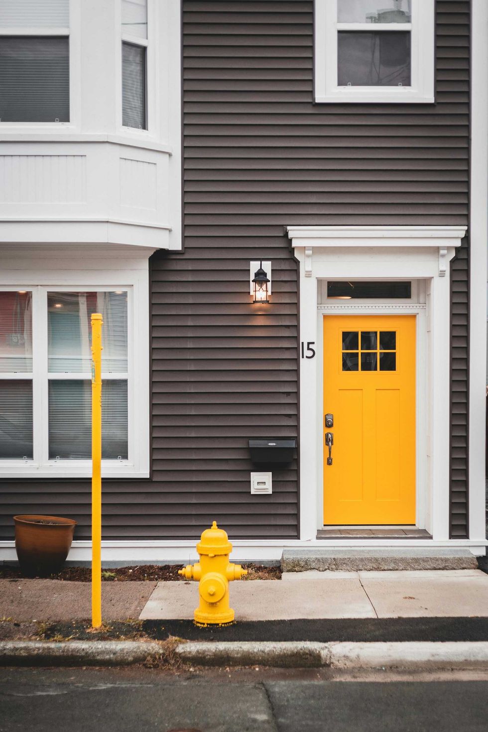
Yellow
Since it's such a bright, standout color, your yellow door risks becoming the focal point of your home, taking away from the rest of its charm. If not painted in the exact right shade, it can look rather tacky.
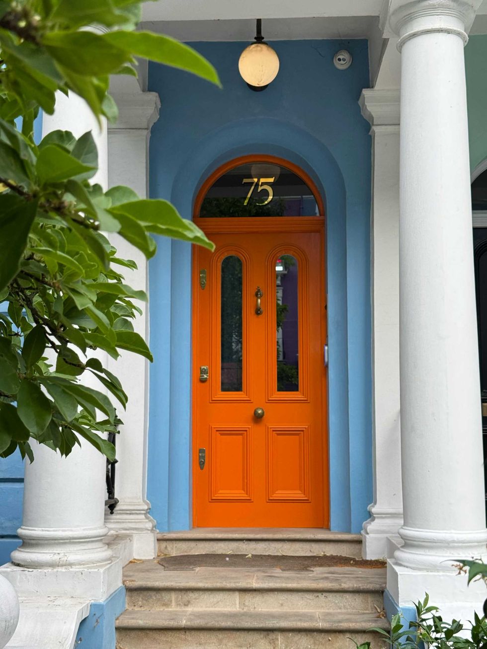
Orange
While I certainly appreciate the boldness of this particular color choice, it’s the fastest way to cheapen your curb appeal. Unless you’re trying to make your home look akin to a Halloween Fun House, you’re gonna want to avoid this color at all costs.
Shutterrstock
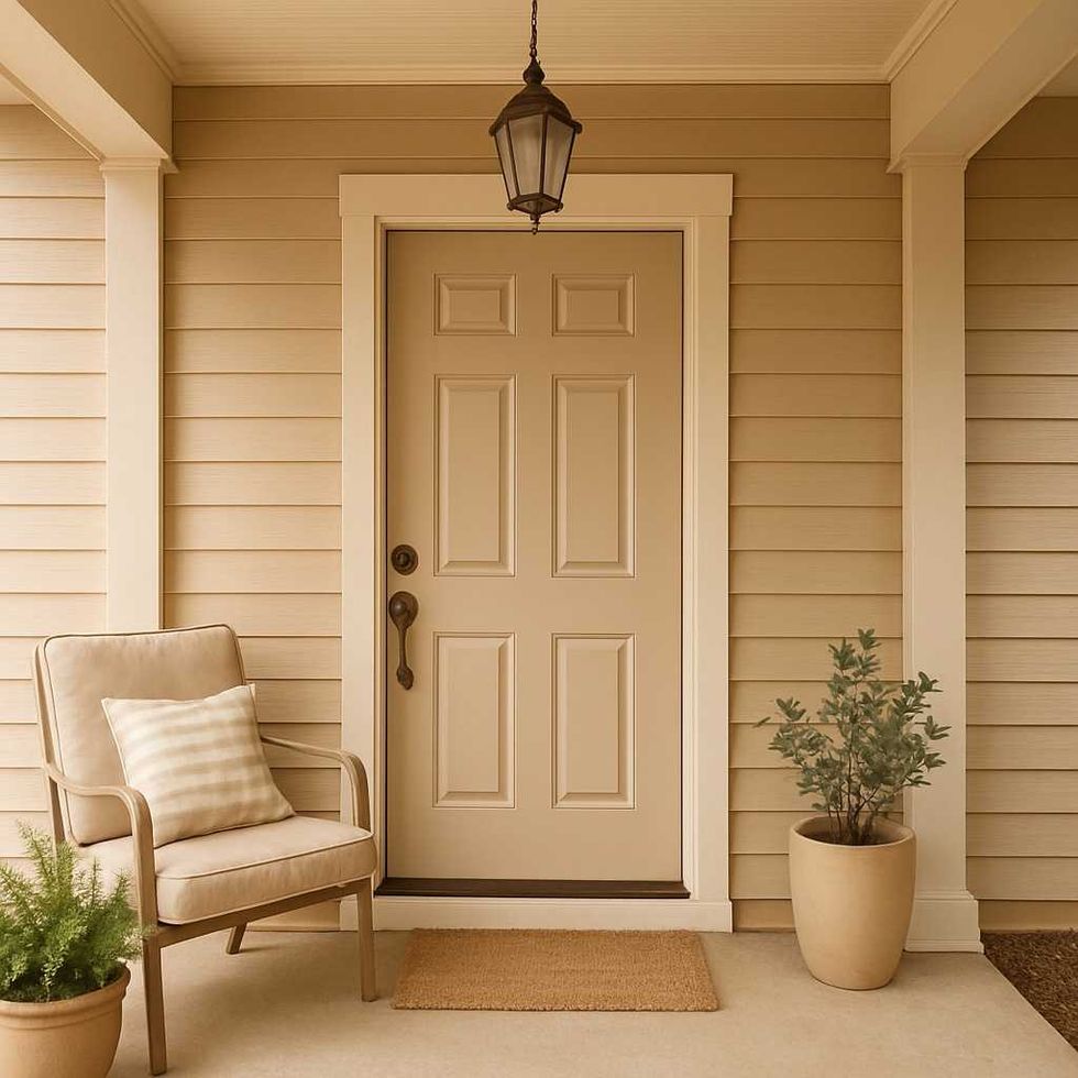
Beige
While it may seem like the most inoffensive, innocuous choice, beige doors tend to look outdated in 2025; worse, the color gives your home a faded look, making it appear unremarkable and almost invisible to passersby.
No thanks!
Shutterstock
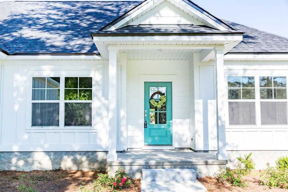
Turquoise
I see this door color a lot when passing the beachy seaside houses in Sarasota, Florida. While I very much appreciate the spirit of this color, which evokes tropical bliss and breezy charm, it unfortunately detracts from your overall aesthetic. Sure, it’s playful, but it lacks the sophistication and elegance that most people want for their home.
Shutterrstock
Neutral Tones
Here’s another one of the classic “safe” options that homeowners like to turn to when they’re worried about their place appearing cheap. While you’d think neutral tones would be ideal for your front door, they tend to make your living space appear unremarkable to passersby.
What To Do Instead
Shutterrstock
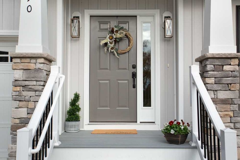
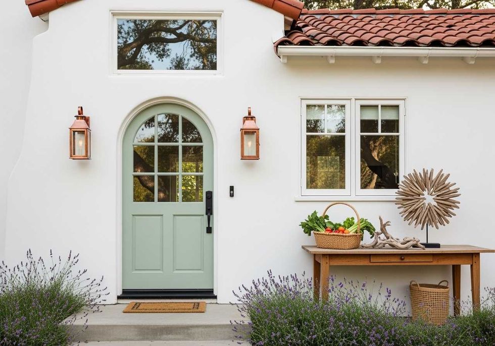
The goal is to find hues that complement but stand out from your siding for maximum curb appeal. Blues, earthy greens and sage, even black and red add a pop depending on the color they're paire with. Head to your local paint store for inspiration ideas that pair the best colors together.
Subscribe to our newsletter to shop even more home decor inspiration!