 Recommended for you
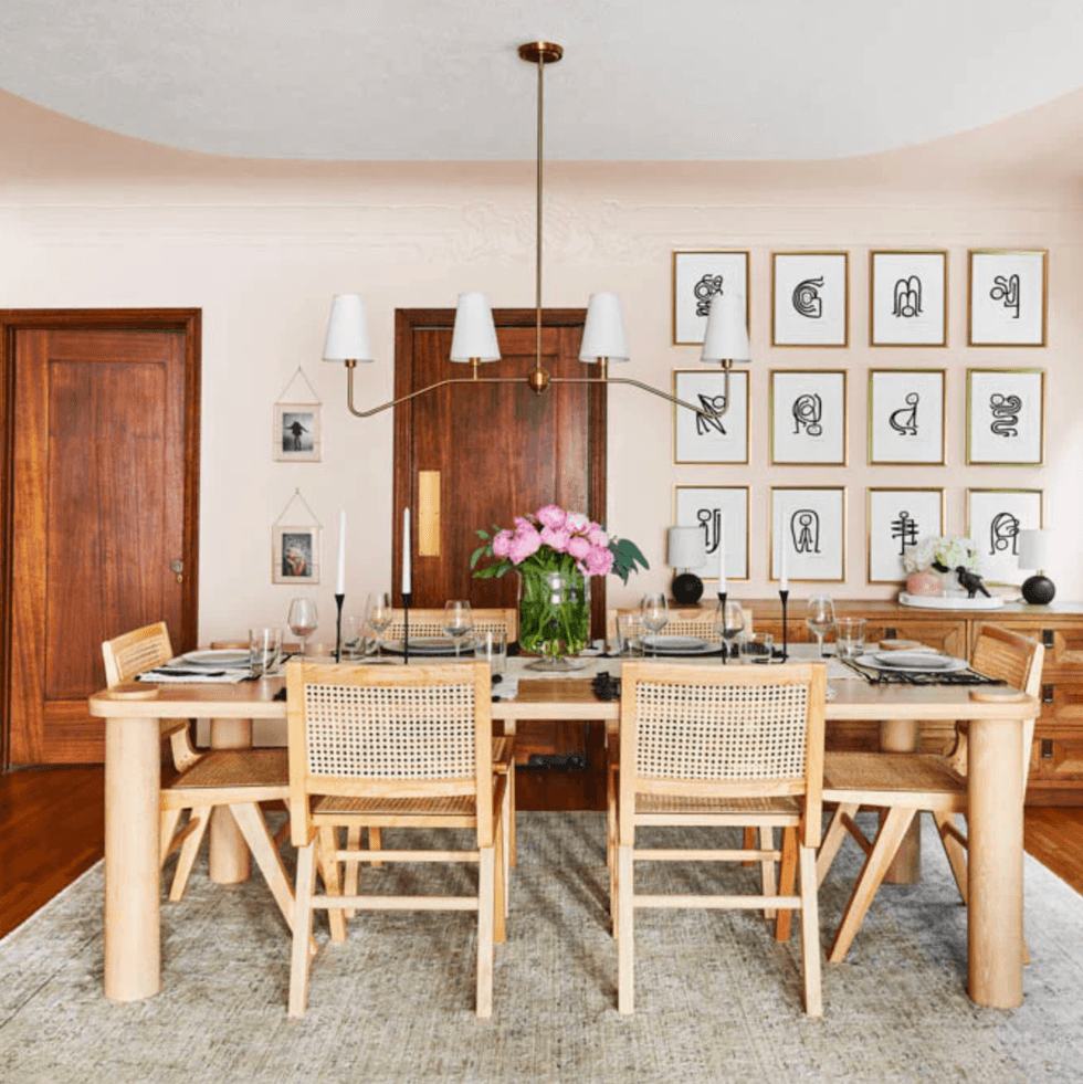
If you’re craving a home refresh for spring, interior designers agree on one thing: pink is officially having a moment. Soft blush, dusty mauve, and romantic rose tones are replacing or complementing predictable neutrals, bringing warmth, personality, and a subtle sense of luxury into everyday spaces. Think of it as the new beige, but way more interesting.
Unlike stark whites or cool grays, pink-based neutrals add warmth that instantly makes a room feel more inviting, calmer, and just a little more elevated.
Whether you’re leaning into a soft barely-there blush or a deeper terracotta rose, these trending shades prove that pink can feel sophisticated, modern, and surprisingly versatile. Give it a try!
Try these gorgeous pink paint colors in your home decor!
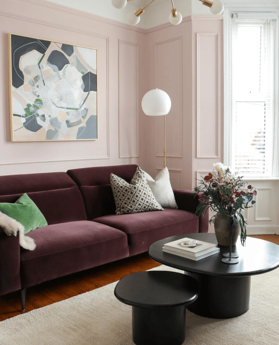
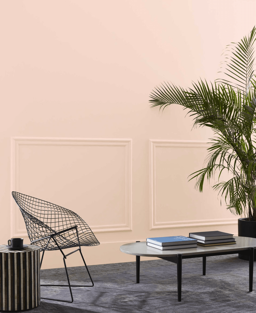
@othersideofthewindow via Farrow and Ball
Setting Plaster
Farrow & Ball’s Estate Emulsion delivers a classic soft pink inspired by the natural blush of freshly plastered walls. The shade feels timeless rather than trendy, giving living rooms and bedrooms a subtle warmth that reads as neutral while still adding character.
Benjamin Moore
Conch Shell
Benjamin Moore’s Conch Shell brings a breezy, coastal sensibility to pink. With hints of coral and sunset warmth, the shade adds softness while still feeling polished enough for living rooms or dining spaces.
@eyesccreamqueen via Backdrop
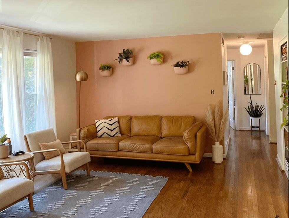
36 Hours in Marrakesh
Backdrop’s 36 Hours in Marrakesh leans deeper and moodier, landing somewhere between terracotta and rose. The shade feels warm, earthy, and slightly dramatic—perfect for accent walls or dining rooms that benefit from a richer palette. (Also, I love the name).
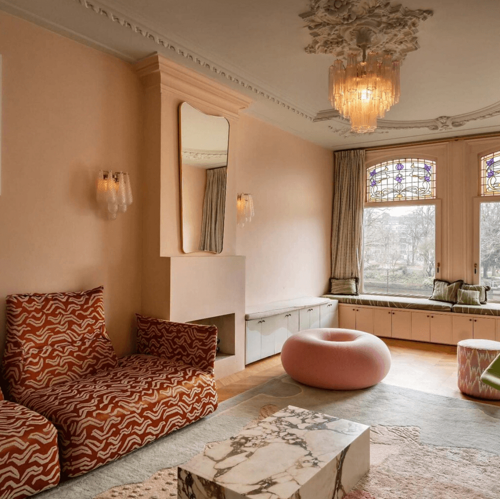
@homeatheathfield via Farrow & Ball
Calamine
Also from Farrow & Ball, Calamine leans classic and slightly stronger in tone, making it perfect for rooms with a lot of natural light. In larger spaces, the color creates a cozy envelope effect that feels refined rather than overly sweet.
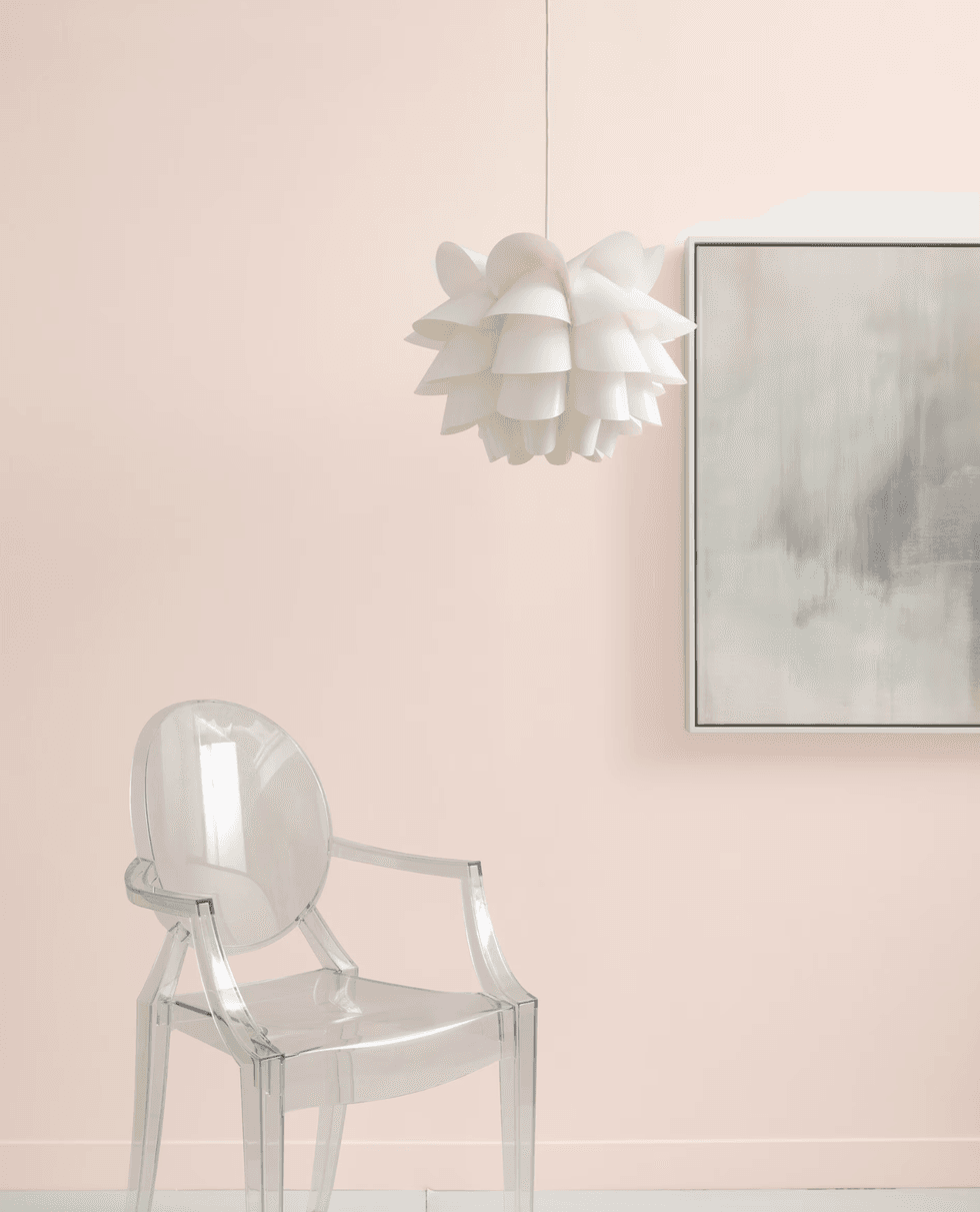
@arluci_lighting via Farrow & Ball
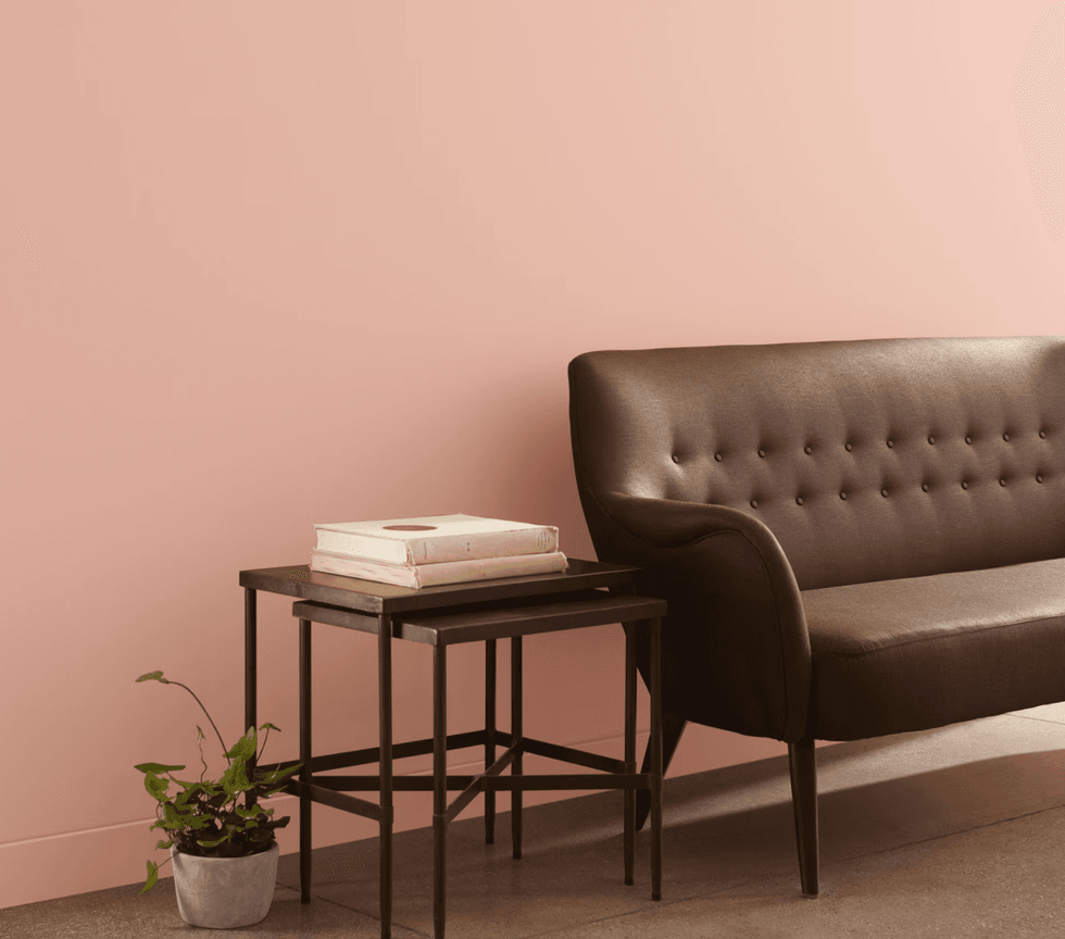
Pink Ground
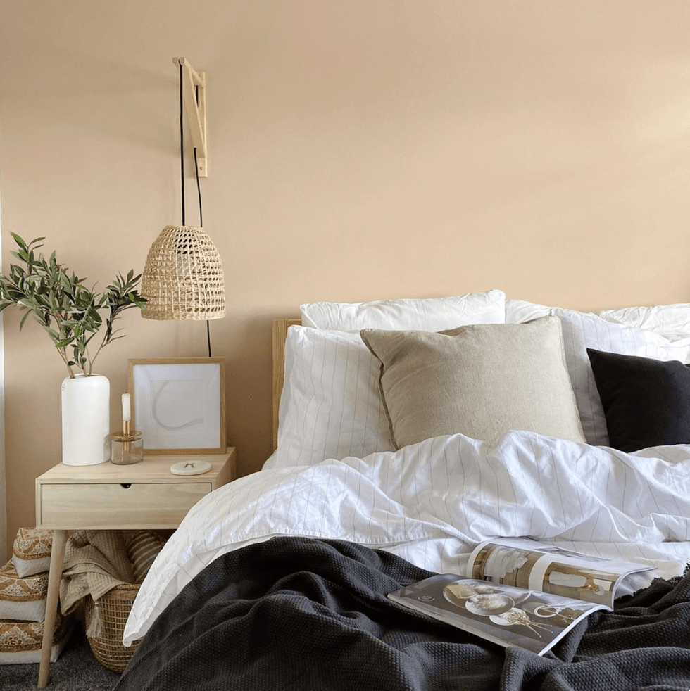
One of Farrow & Ball’s most beloved pinks, Pink Ground has a dusty undertone thanks to its yellow pigments. The warmth keeps it from feeling sugary, making it ideal for pairing with crisp whites or creamy woodwork.
Benjamin Moore
Love & Happiness
This peachy-pink shade from Benjamin Moore strikes the perfect balance between personality and subtlety. It’s calming without fading into the background—an ideal choice for bedrooms, reading nooks, or any space meant to feel relaxed.
Clare Paint
Meet Cute
From Clare, Meet Cute offers a modern blush that feels playful yet polished. Designers love it for adding a dose of personality without overwhelming a space.
Benjamin Moore
Head Over Heels
For something softer, Head Over Heels from Benjamin Moore delivers a delicate pink that still makes a statement. It has an almost vintage quality that works beautifully in traditional interiors.
Sherwin Williams
Malted Milk
Sherwin-Williams’ Malted Milk reads like a reddish neutral with pink undertones. The sophisticated shade feels cozy and refined, making it a natural fit for bedrooms, hallways, or anywhere you want subtle warmth.
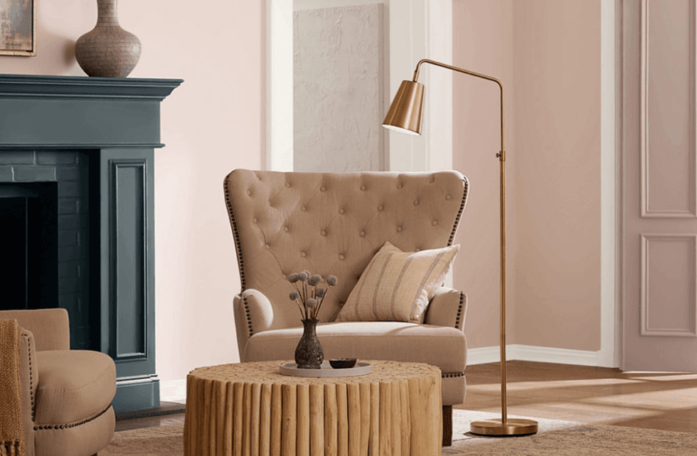
The takeaway: pink is no longer just an accent—it’s the statement color of the year. From airy blush tones to richer mauves, these shades bring warmth, softness, and a flattering glow that instantly makes a room feel more welcoming.
Subscribe to our newsletter to shop more stunning decor for spring and beyond!