 Recommended for you
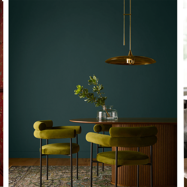
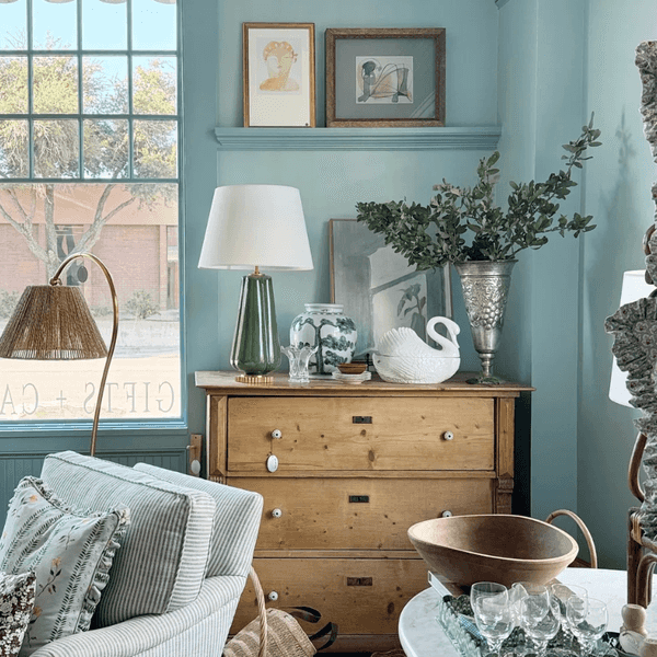
I love a spicy orange, but when it comes to my home, I’m not a fan — especially that bright Halloween orange that pops up everywhere this time of year. Luckily, fall offers plenty of other shades that feel just as cozy and festive, while leaning warmer, richer, and more inviting. This season, color trends are all about jewel tones, earthy hues, and even a hint of powder pink. Whether you're decorating, entertaining, or simply want to add a touch of color to a neutral space, these fall finds will refresh your space for the season.
Orange not for you? Try these fall colors instead in 2025!
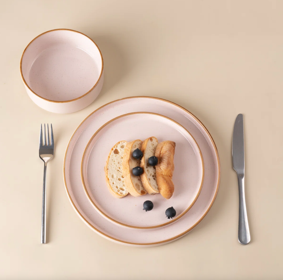
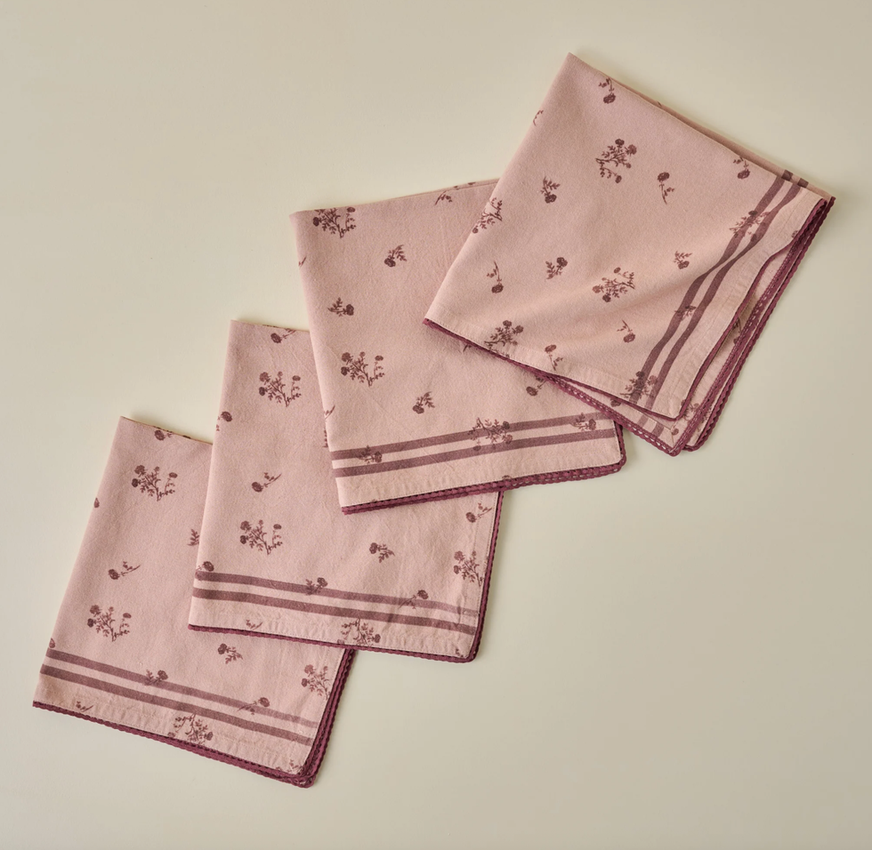
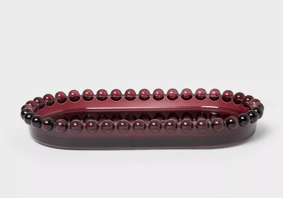
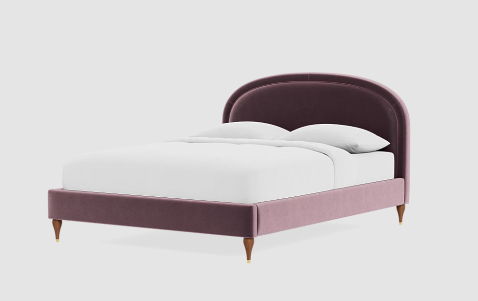
Powder Pink + Maroon
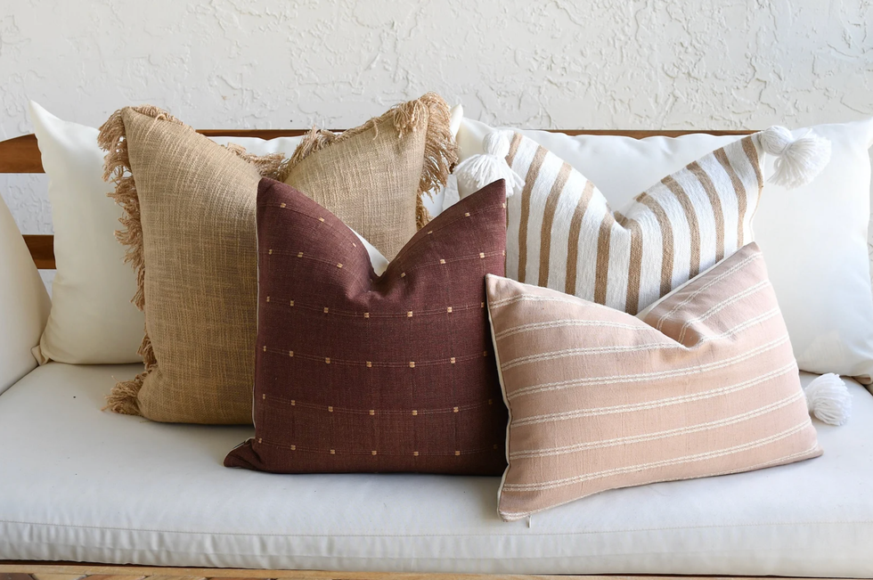
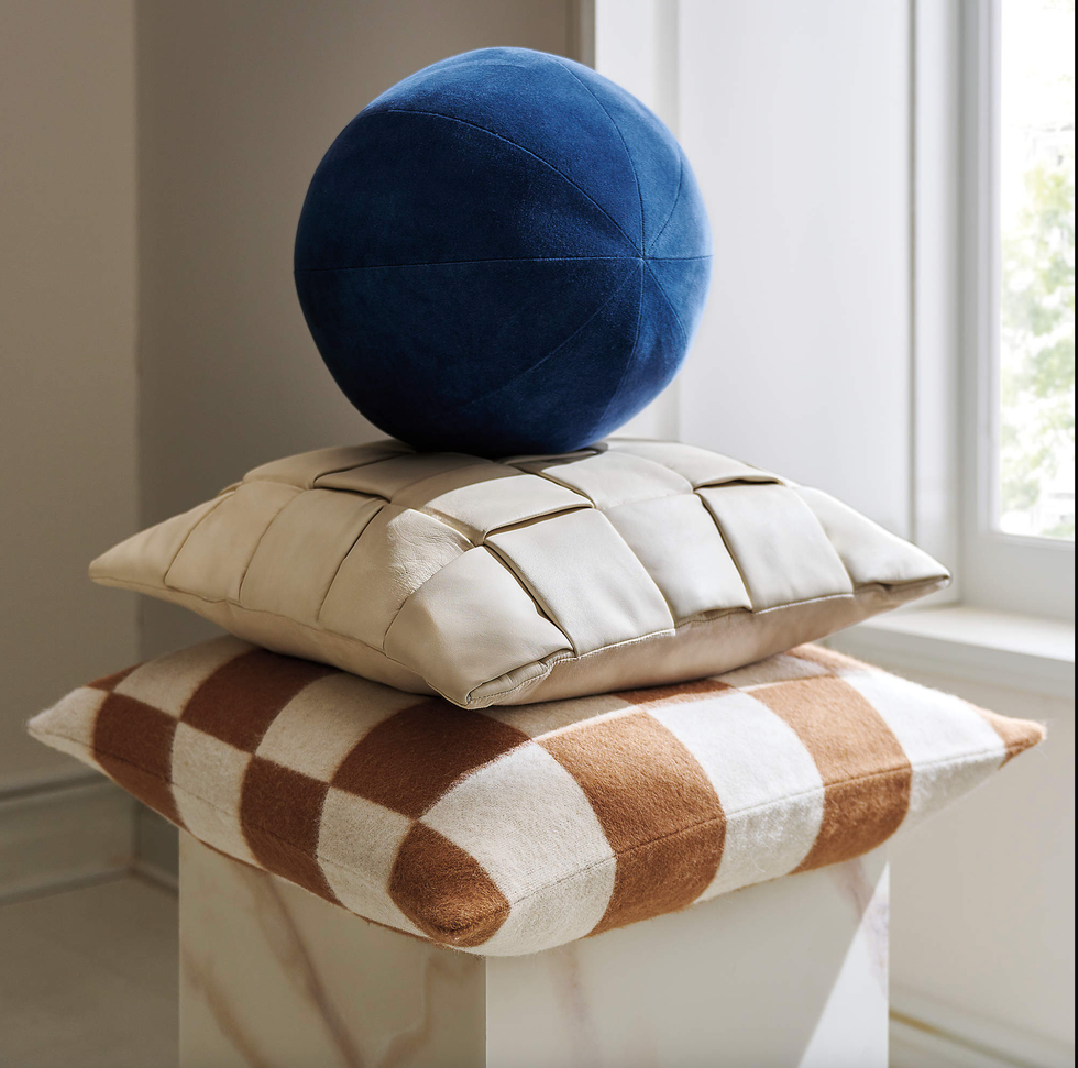
Etsy
Etsy Pillow Cover Combination
Pastels aren’t just for spring. Powder pink is stepping into the fall palette as a soft, unexpected twist. It pairs beautifully with wood tones, creamy neutrals, and even metallic accents, giving your space a cozy yet elevated vibe. It’s subtle with a Scandi vibe, but it instantly freshens up the room. On the opposite end of the spectrum, maroon is fall’s bold and moody star. Think autumn leaves, mulled wine, and candlelit dinners. Maroon works especially well in textiles — like pillows, area rugs, or even a color drenched powder room for warmth and sophistication. Paired with brass or natural wood, it feels timeless, luxe, and perfect for the season.
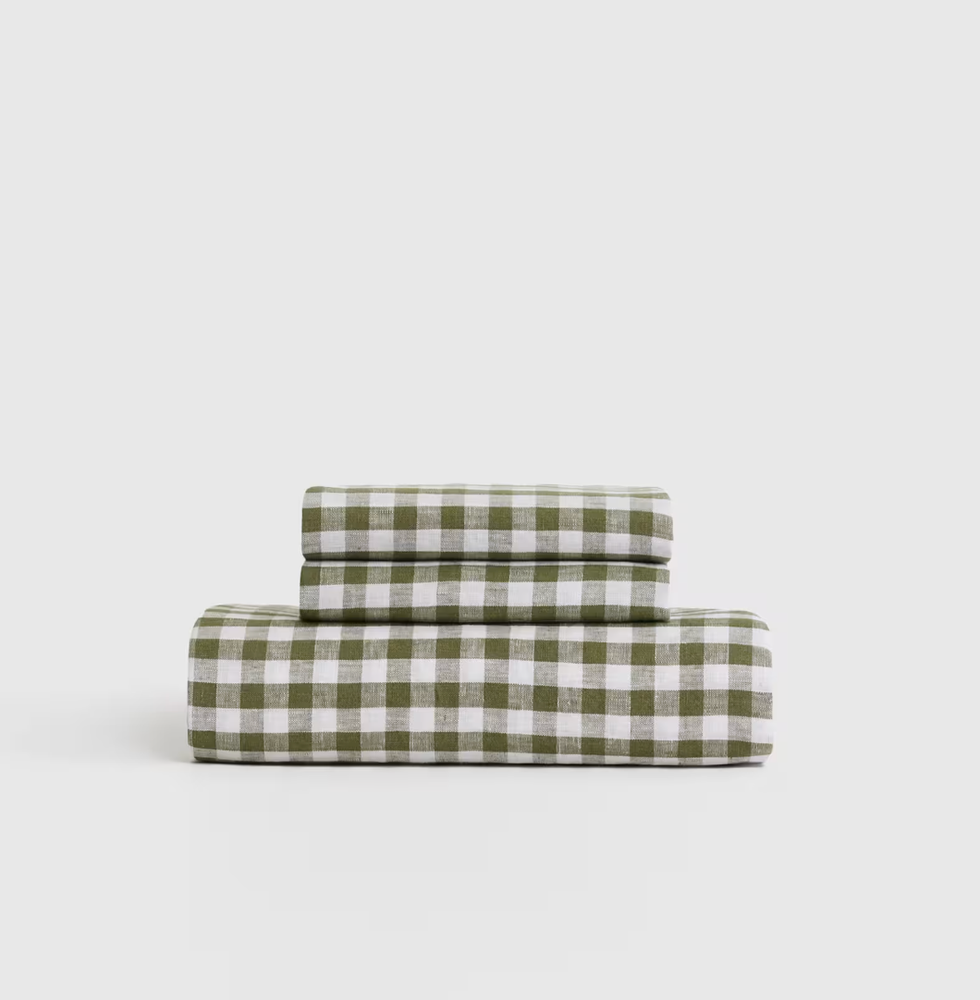
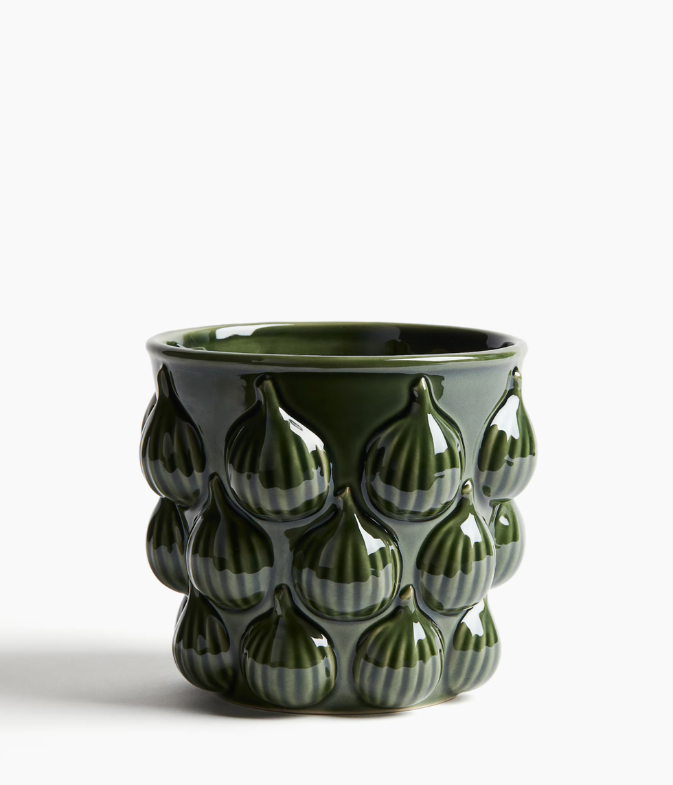
Grass Green

Zara Home
Zara Home Stoneware Serving Dish
Bold, fresh, and a little unexpected, grass green is making its way into fall color palettes. This nature-inspired shade brings energy and a bit of vibrancy into cozy fall spaces. It pairs beautifully with warm wood accents, earthy browns, and even softer shades like blush or cream for a modern twist.
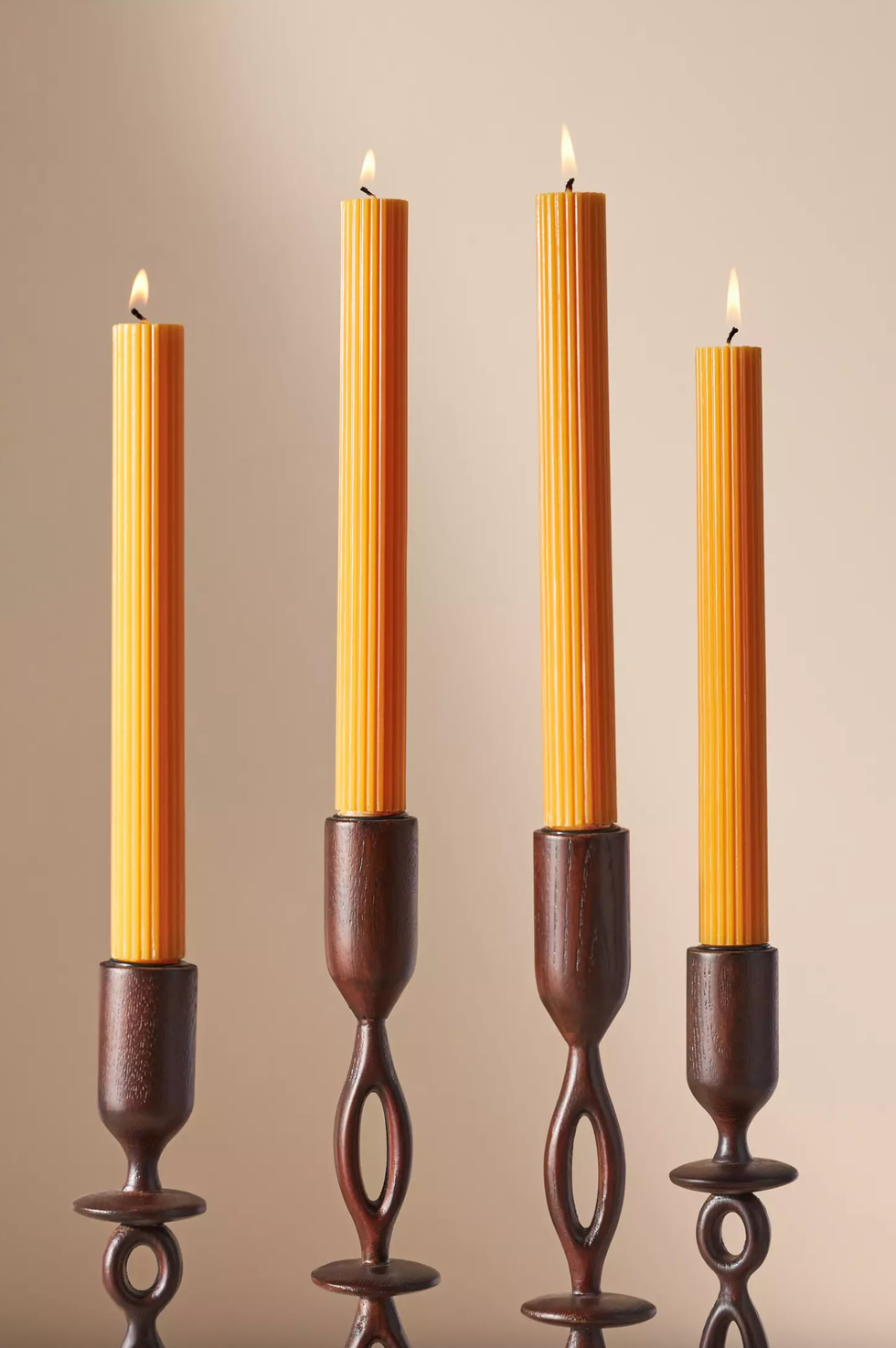
Mustard
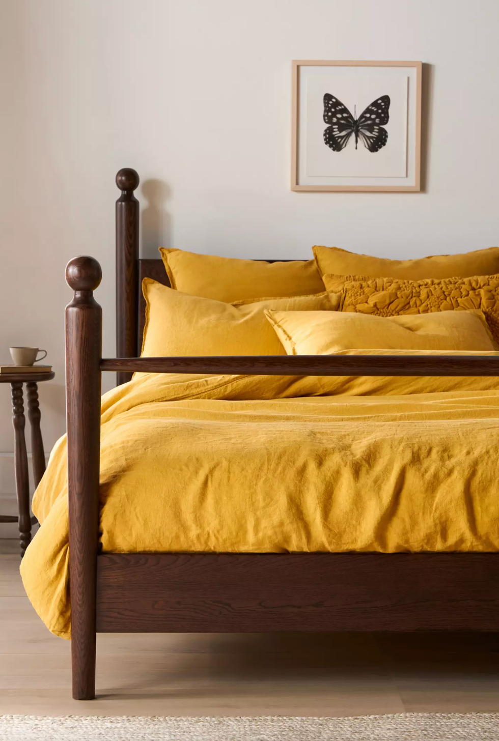
Anthropologie
Anthropologie Washed Linen Duvet Cover
Mustard is a fall classic, but this season it feels especially chic. Richer than butter yellow yet softer than gold, it brings warmth without overpowering a space. Mustard pairs beautifully with earthy neutrals, deep blues, and even jewel tones like emerald or maroon. Use it in cozy textiles and other accents to instantly brighten up your home while keeping the vibe totally fall.
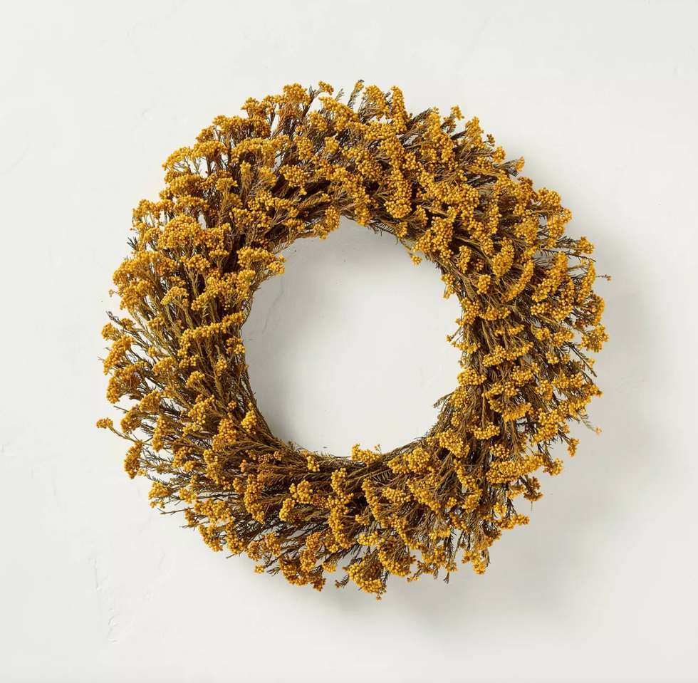
Target
Hearth & Hand x Magnolia Golden Fall Wreath
Chocolate Brown + Sapphire Blue
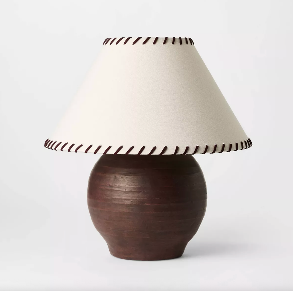
Target
Threshold x Studio McGee Earthy Table Lamp
Chocolate brown is stepping up as a luxe neutral this fall. It’s warmer than black and richer than beige, making it the perfect backdrop for layering in cozy textures and pops of color. Pair it with powder pink for a soft contrast or with maroon for a bold, tonal look. A pop of sapphire blue brings a jewel-toned richness that feels dramatic and timeless. It's a bit moody while still feeling fresh.

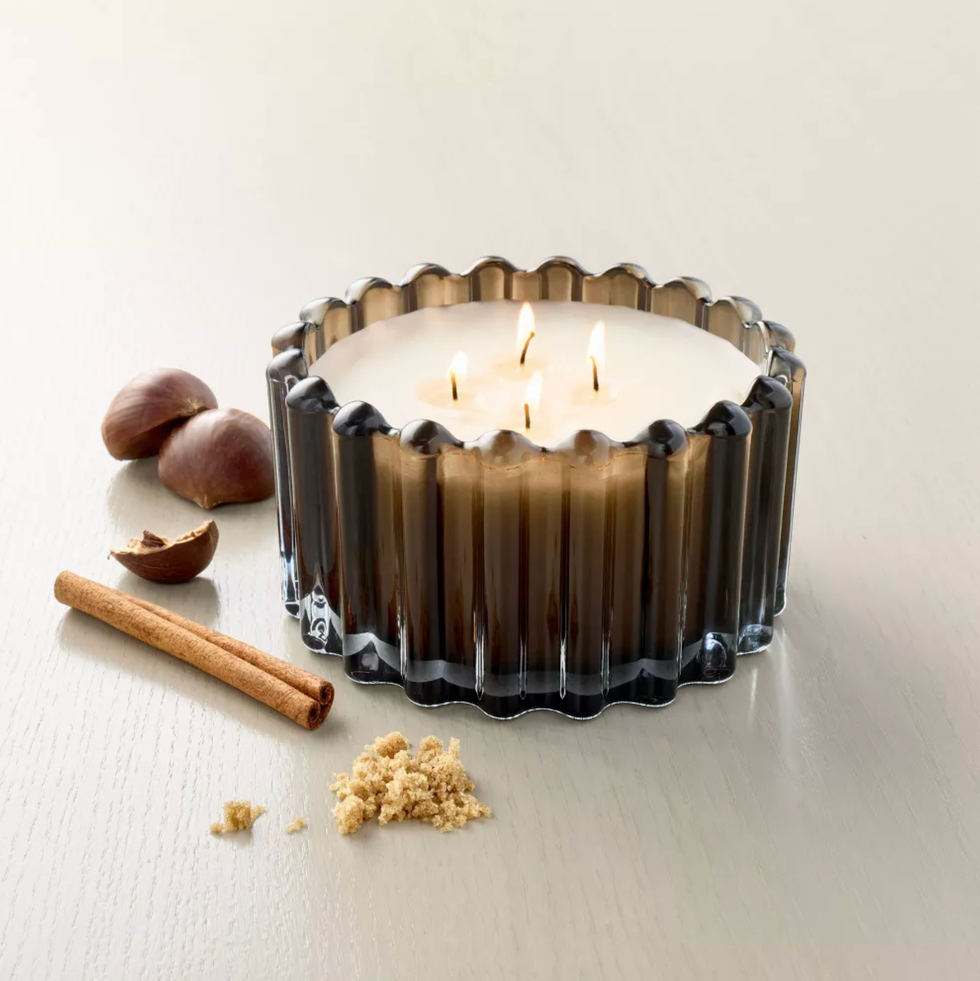
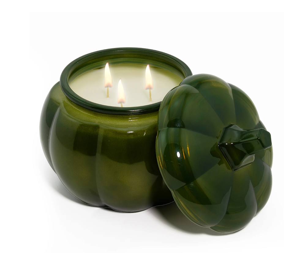
Target
Hearth & Hand x Magnolia Jar Candle
Muted Purple

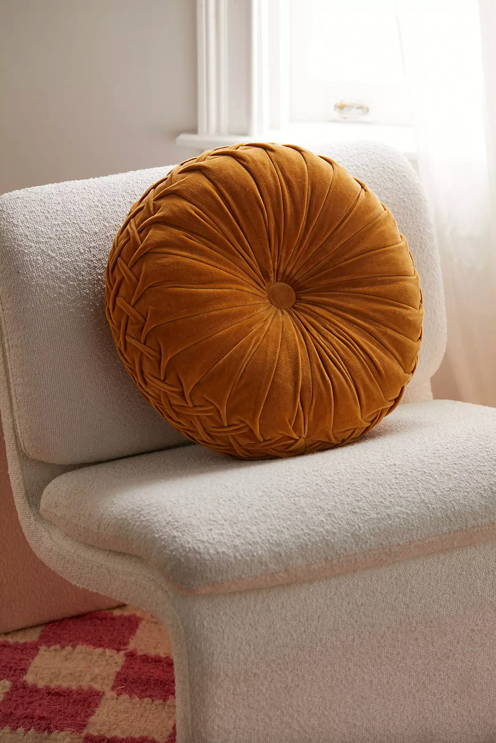
Joon Loloi
Ruth Pillow
Softer than plum but richer than lavender, muted purple is a subtle way to add a moody and romantic vibe to your home. Layer it through textured textiles and upholstery. Muted purple pairs beautifully with earthy neutrals like chocolate brown and mustard, or you can mix it with jewel tones like sapphire blue for a bolder statement.
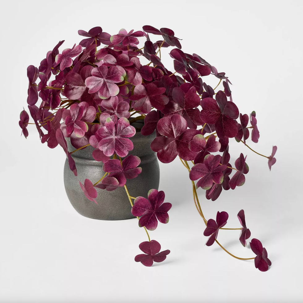
Target
Threshold x Studio McGee Fall Floral Arrangement Purple
Subscribe to our newsletter for more fall decor inspo!
Brit + Co may at times use affiliate links to promote products sold by others, but always offers genuine editorial recommendations.