 Recommended for you
Planning a paint refresh this year? Same. There’s something about a new color on the walls that instantly makes a space feel like a fresh chapter — and Sherwin-Williams’ biennial color trend report is exactly where we’re looking for inspiration. Their 2026 color predictions unveil four distinct palettes, each with its own personality, mood, and styling moment (we’re especially drawn to the moody, cozy Restorative Darks). From soft, frosted tints to rich, sunbaked hues, these forward-thinking shades make it easy to reimagine your home, whether you’re craving a calm, cocoon-like bedroom or a bold, confidence-boosting powder room.
Scroll for Sherwin-Williams’ paint color trends for 2026!
Frosted Tints
Sherwin Williams
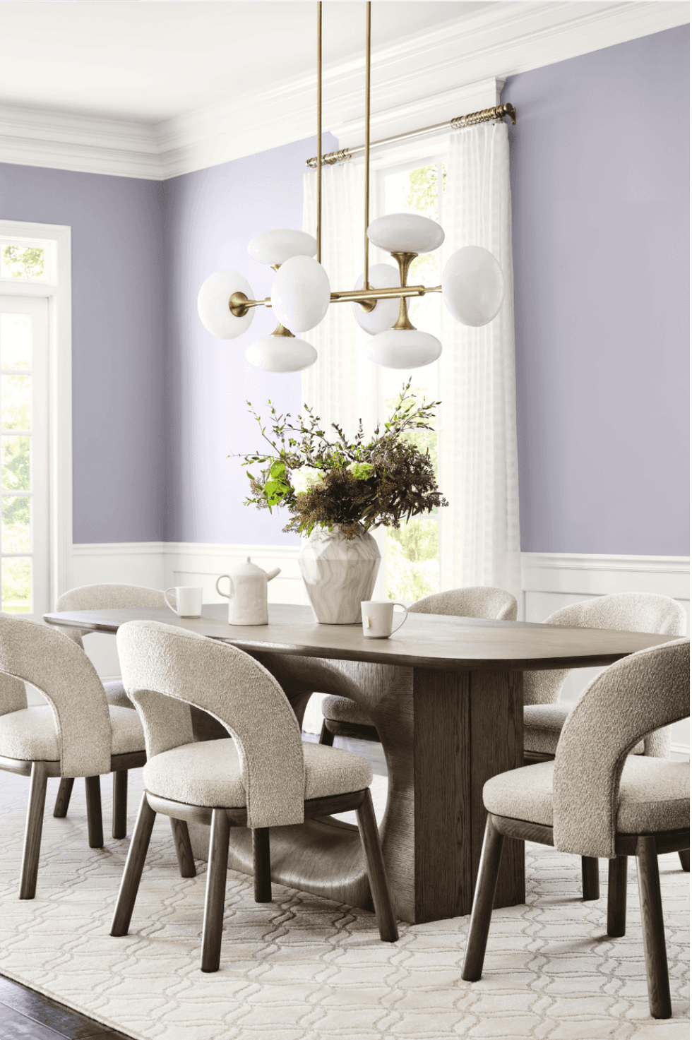
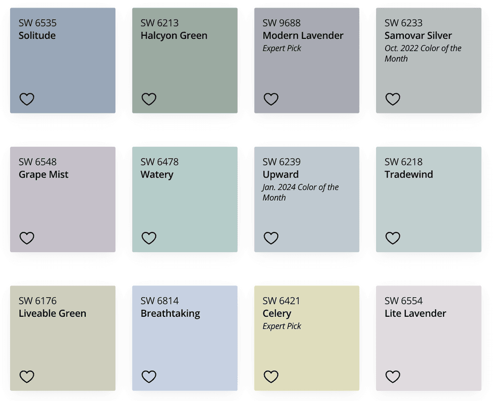
Modern Lavender
This cool, cheerful, and classic palette blends icy, tinted pastels — soft blues, misty greens, and gentle violets — designed to mix and match easily. Think spa-day vibes with a futuristic twist.
How To Use It
Sherwin Williams
Try a frosted blue green like Watery in a sunroom to emphasize the natural light; pair a playful violet like Lite Lavender with airy whites in a bedroom; or use a light green like Celery for kitchen cabinets to create a subtle, unexpected pop.
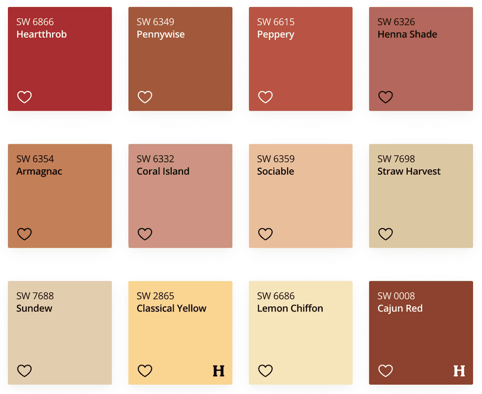
Sunbaked Hues
Sherwin Williams
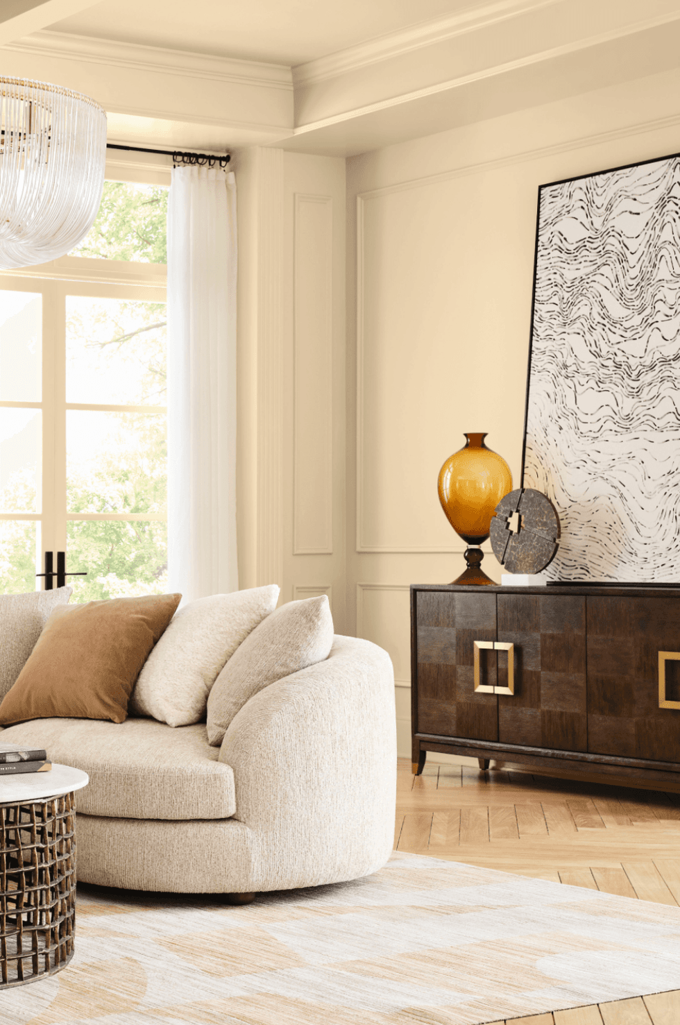
Sundew
Inspired by clay, buttery yellow, and rich, sun-drenched reds, this warm, nostalgic, and bold palette feels like summer afternoons and terracotta rooftops.
How To Use It
Sherwin Williams
Wrap your dining room in a burnished terracotta like Armagnac for cozy dinner-party vibes; bring a light yellow like Lemon Chiffon to a small powder room for a sunny mood boost; or paint your front door in a deep, earthy red like Cajun Red to instantly elevate your curb appeal.
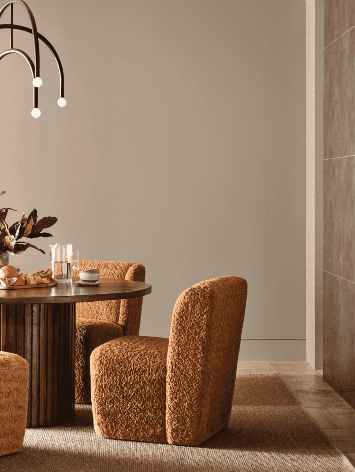
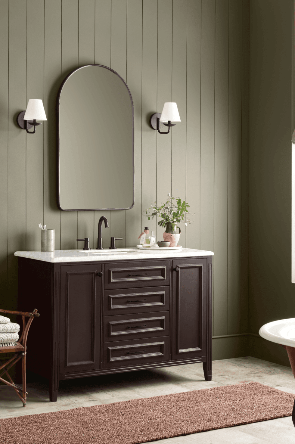
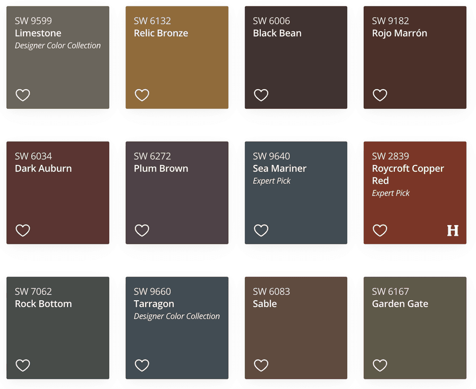
Restorative Darks
Sherwin Williams
Garden Gate
Deep, nocturnal colors — think inky blue, forest green, and charcoal — offer a cocooning effect that’s perfect for cozy spaces meant to recharge you. Think sophisticated, moody, and restful.
How To Use It
Sherwin Williams
Turn a reading nook into a dramatic hideaway with near-navy walls in Sea Mariner; pair a Plum Brown accent wall with white oak furniture in a home office; or drench your bedroom in Sable for a luxe, sleep-friendly retreat.
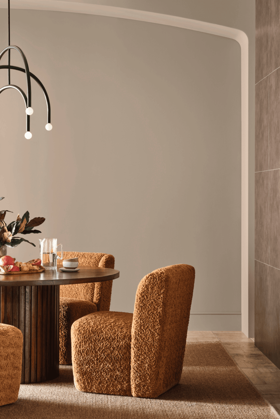
Foundational Neutrals
Sherwin Williams
Sanderling
These aren’t your average neutrals. This gradient includes almost-blacks, silvery grays, warm taupes, and sparkling whites— versatile enough to play supporting role or take the spotlight. These are totally versatile, elevated, and timeless.
How To Use It
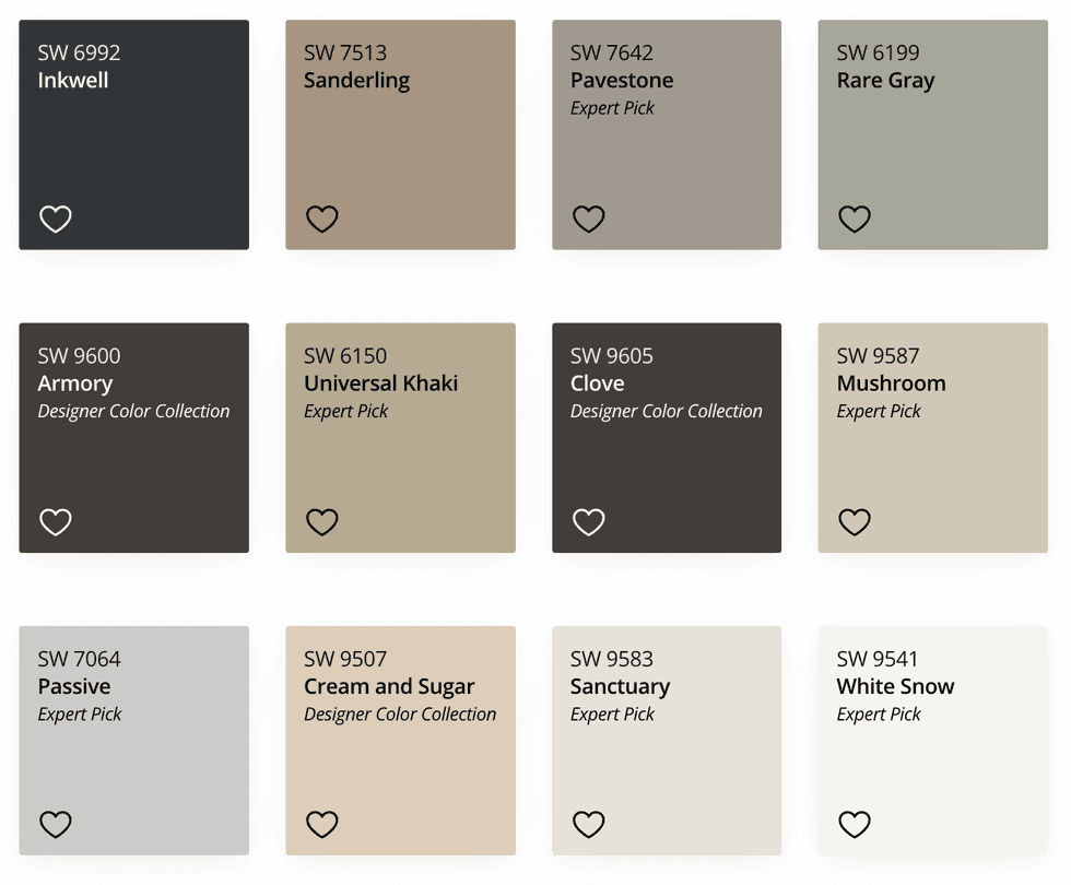
Sherwin Williams
Use a warm and welcoming Clove on kitchen lower cabinets for depth; pair Pavestone walls with marble finishes in a bathroom for a spa-like feel; or create a layered neutral living room with warm Sanctuary walls and crisp white trim in White Snow.
Looking for more home decor inspo? Be sure to sign up for our weekly email newsletter!
Brit + Co may at times use affiliate links to promote products sold by others, but always offers genuine editorial recommendations.