
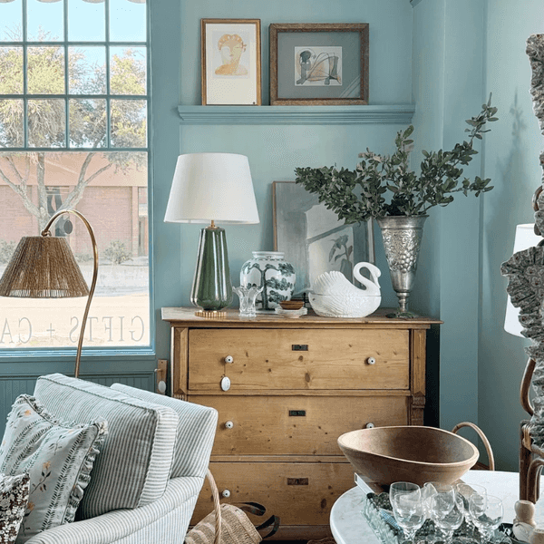
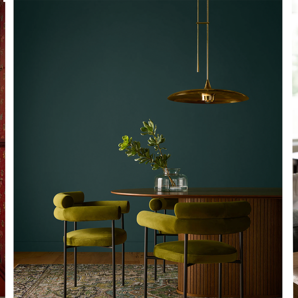
 Recommended for you
A Los Angeles family of four was ready to give their small, outdated home a major refresh when they brought in Barrett Cooke, principal and co-founder of the architecture and design studio Arterberry Cooke, and Luis Garcia, project architect. Originally built on a different parcel of land and later moved to its current site, the house required a full reorientation and total renovation to make it work. Serene paint colors selected in collaboration with interior designer Emily Carlin made all the difference.
Scroll to see the calming paint colors we're obsessed with from this LA home renovation!
BEFORE
Before photo courtesy of Arterberry Cooke
Prior to the renovation, the four-bedroom, three-bathroom home had no sense of flow and character.
“The original front door was at the side of the house,” said Barrett. “We simplified the first floor plan and updated the layout to create more logical and interconnected spaces.”
AFTER
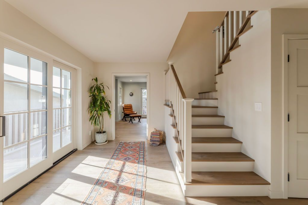
Barrett thoughtfully reimagined the home, expanding the kitchen to maximize functionality and added a rear deck and trellis. The result is an airy and serene oasis.
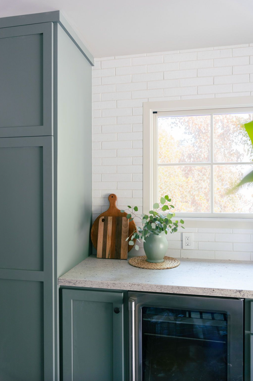
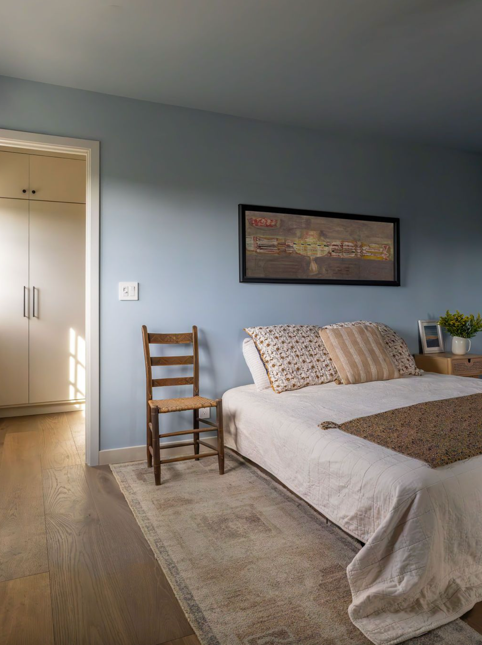
Color was central to creating a cohesive design says Barrett, who embraced natural and earthy hues of blue and green to pair beautifully with the home’s surrounding landscape and natural light. For the kitchen cabinets, she used Green Smoke from Farrow & Ball.
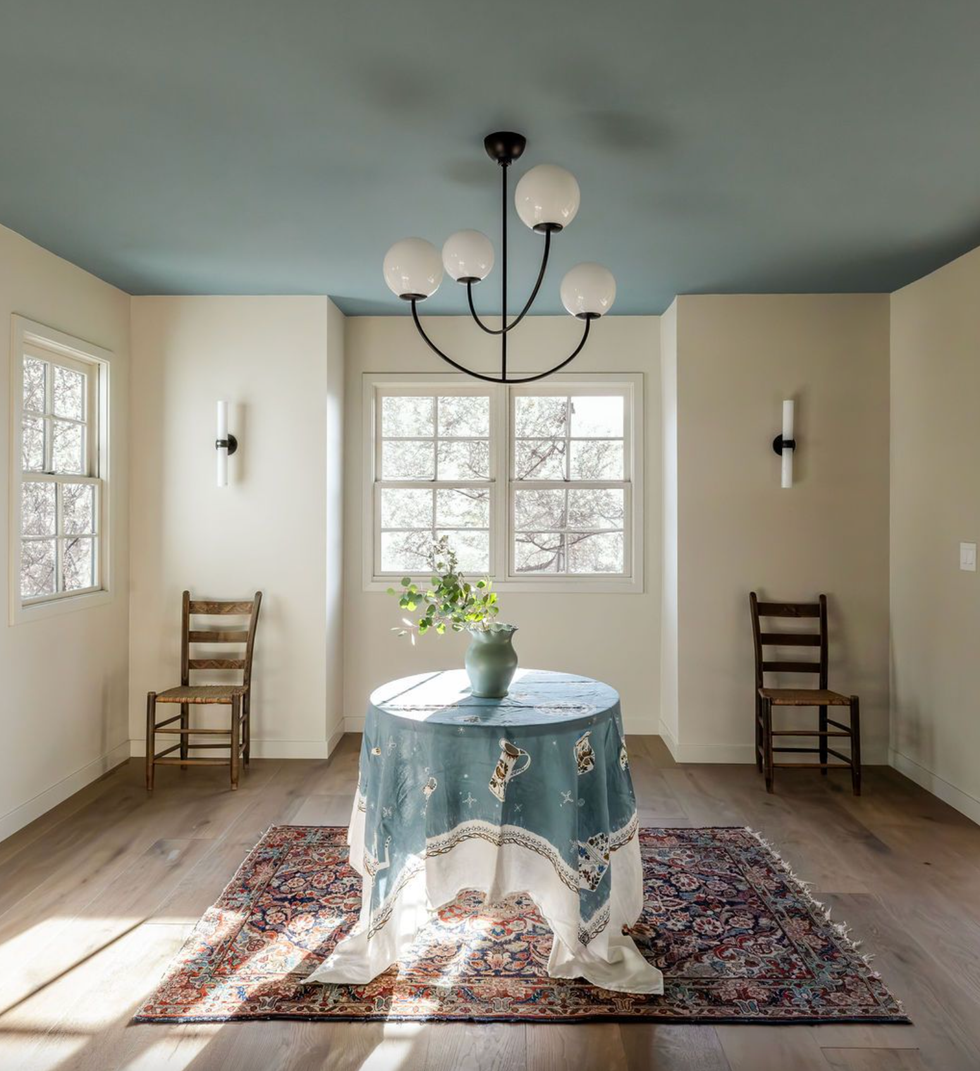
“The blues carry throughout and the bright, more open spaces allow the house to feel integrated while creating separate quiet spaces.” For the ceiling blue, she used Selvedge from Farrow & Ball.
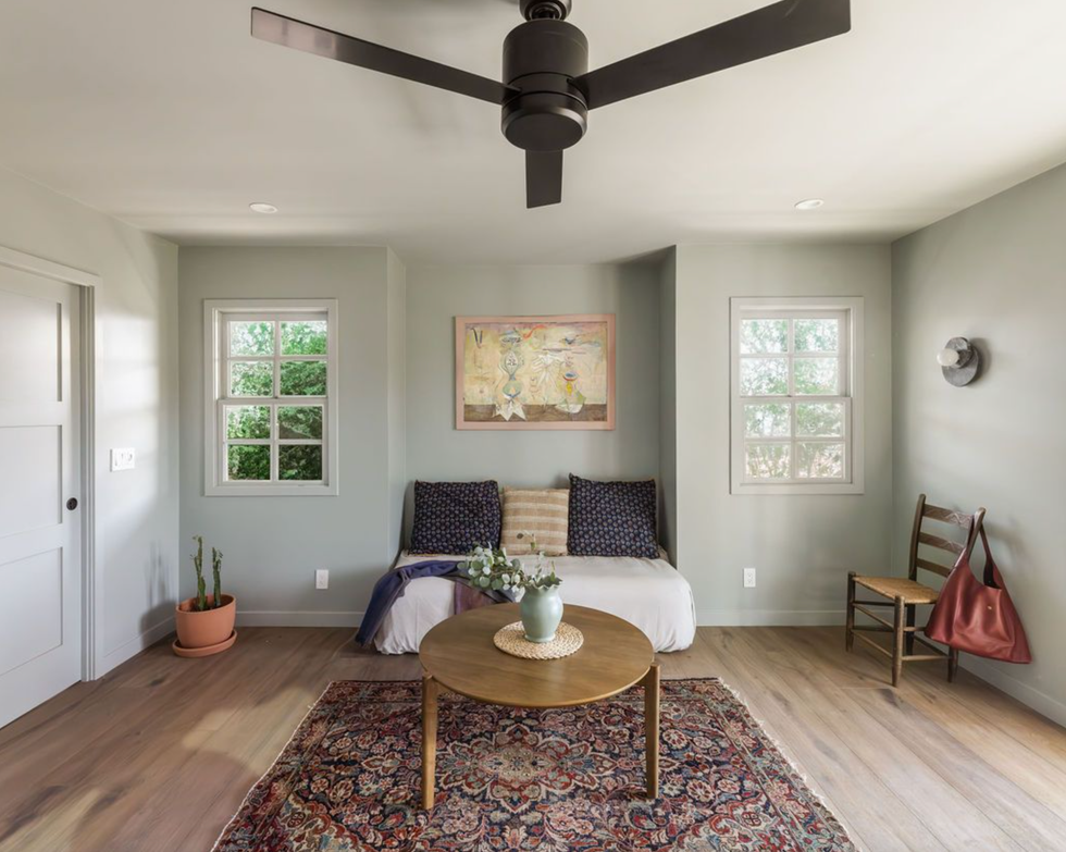
Barrett also created a new addition of a private office that doubles as a guest suite, painted in Farrow & Ball Light Blue.
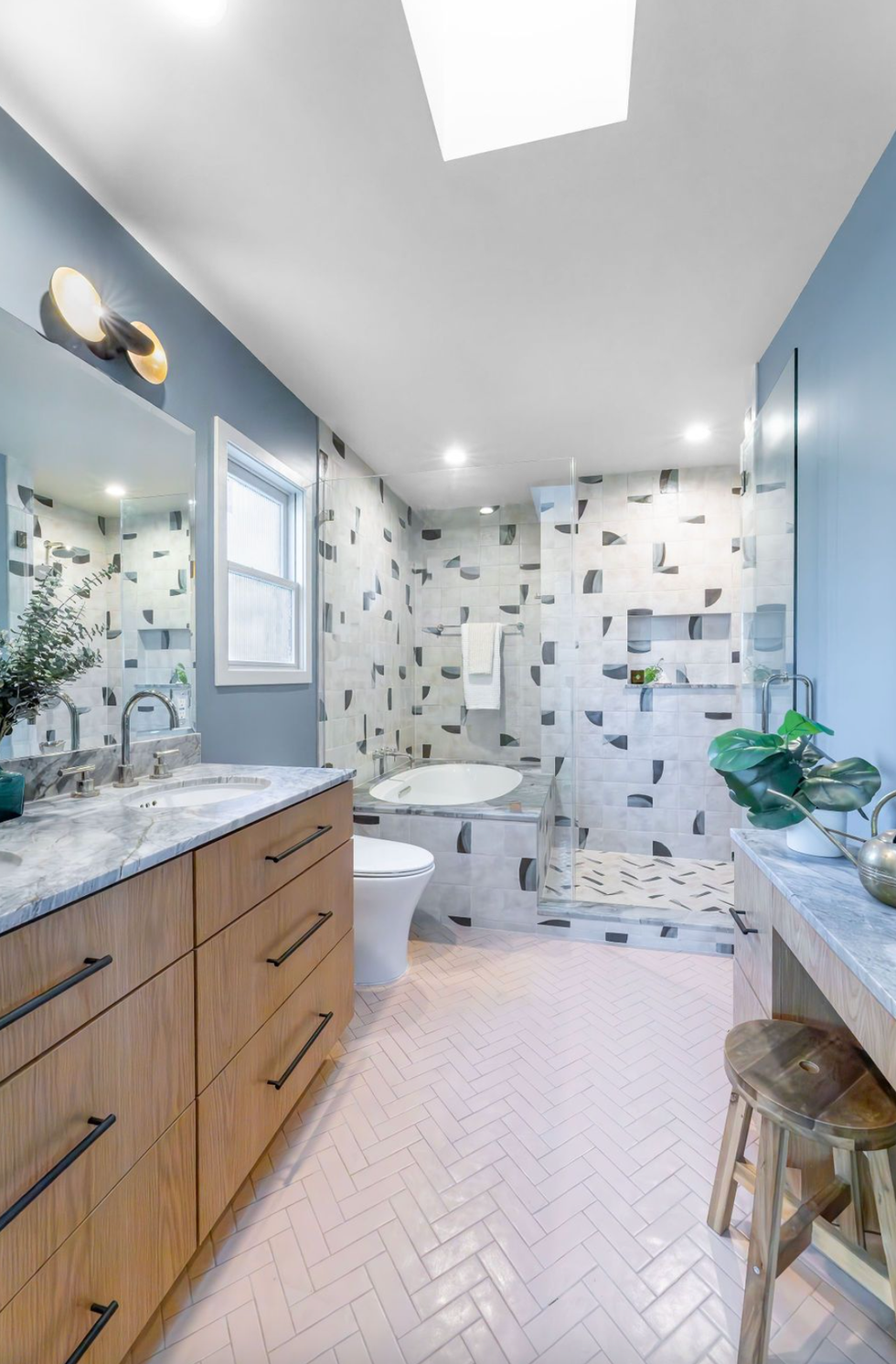
And repeated the color in the bathroom, which was old, cramped and dated.
Barrett also used a mixture of durable surfaces and materials with delicate details. The primary, along with the other baths uses unique tiling to bring out the space’s charm and brightness.
"A wet room concept allowed the homeowner to have a true sanctuary space with a large tub and shower," says Barrett. "The wall tile evokes pottery elements and the stone slab materials (ijen blue quartzite) have an organic feel.”
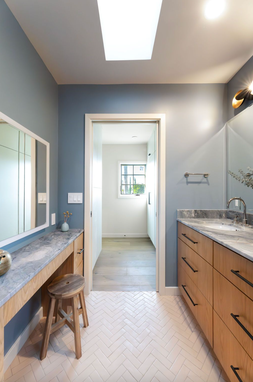
She also squeezed in a makeup vanity for mom. “As the one woman in a house full of boys, this is her sanctuary space," adds Barrett.
The home was transformed from cramped and chaotic — with a jumble of clashing colors like bright yellow and maroon — into a serene, light-filled retreat.
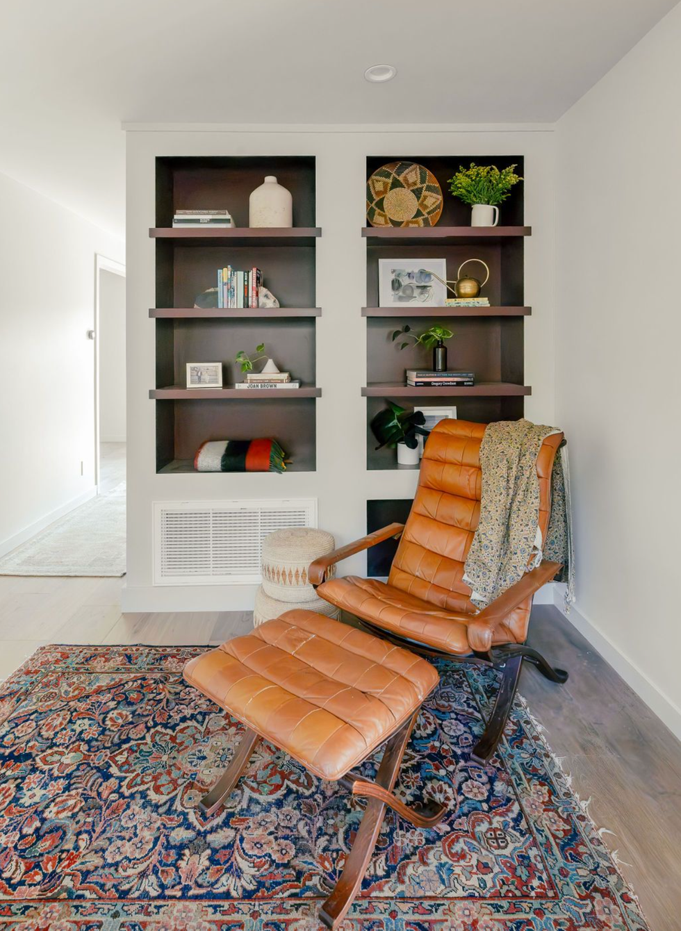
“We love the library moment that is near the entryway and sets the tone for the entire house," says Barrett.
BEFORE
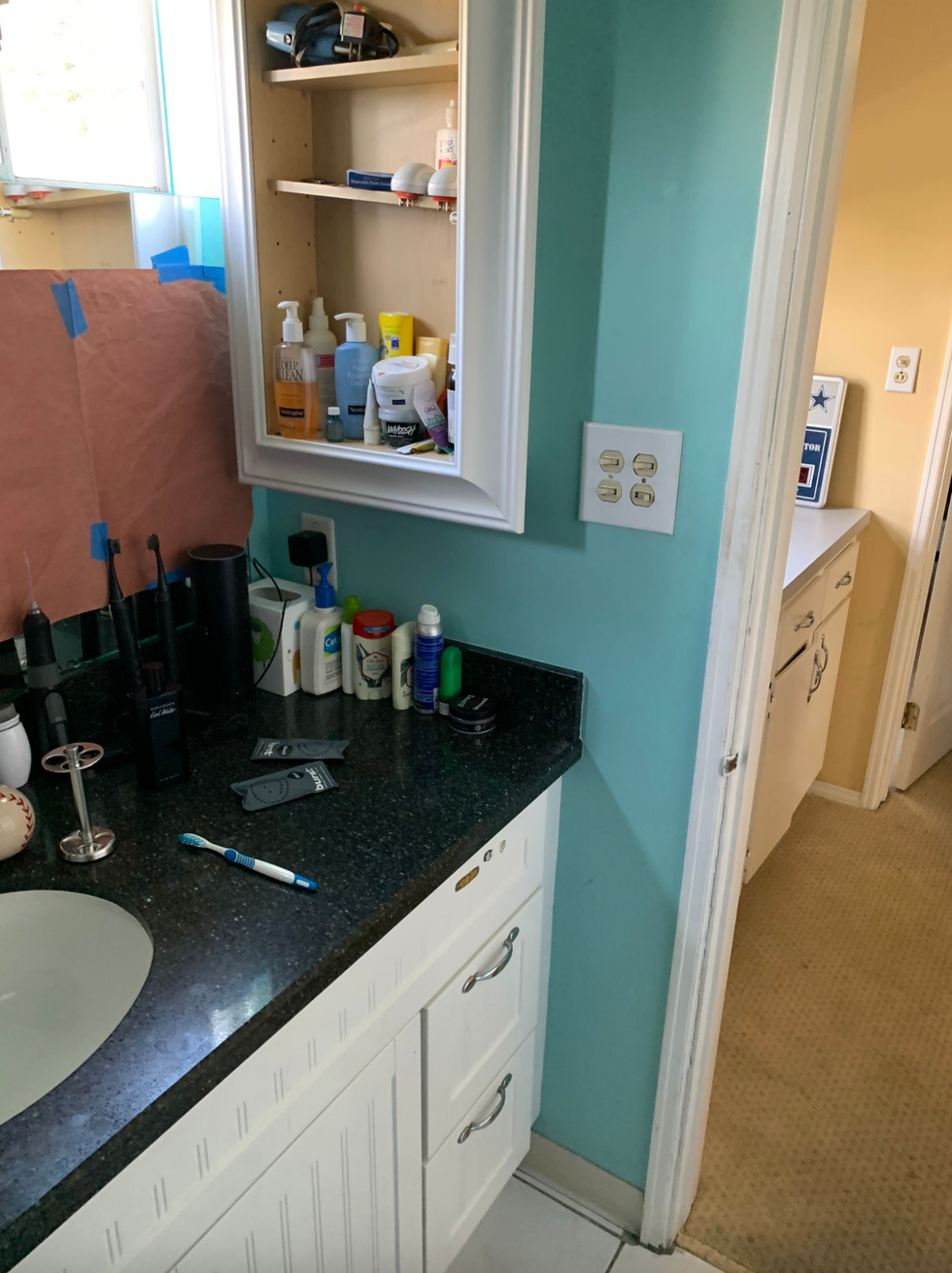
Before photo courtesy of Arterberry Cooke
True to the rest of the home’s original state, the kids’ bathroom had seen better days — and was in serious need of a refresh.
AFTER
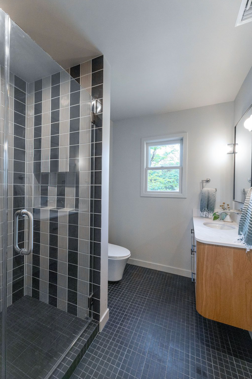
Barrett designed a bold black-and-white bathroom for the family's two teenage sons — a playful departure from the rest of the home’s softer palette. “This bathroom is for two teenage boys so we wanted it to be fun and graphic but still sophisticated and timeless," she says.
BEFORE
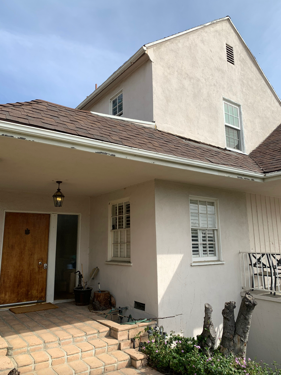
Before photo courtesy of Arterberry Cooke
The original home's exterior left a lot to be desired.
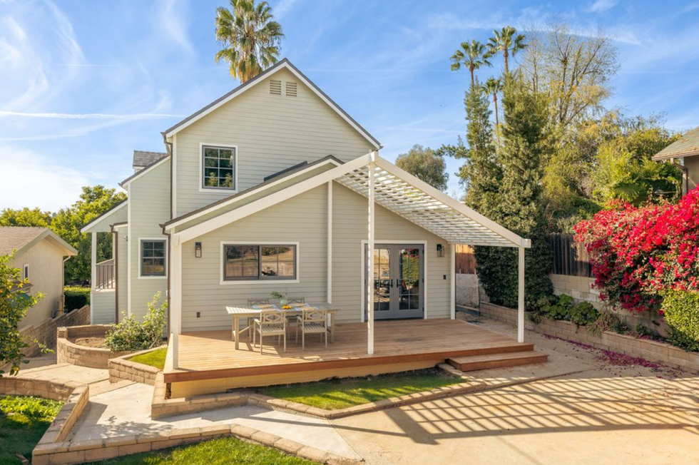
Following an 8-month renovation, the home is now bright, airy, and functional. The overall aesthetic? “Peaceful retreat in the chaos of an all-boy household while also being durable and sustainable for years of use,” says Barrett.
Check out our online newsletter for more home decor inspo!
Brit + Co may at times use affiliate links to promote products sold by others, but always offers genuine editorial recommendations.