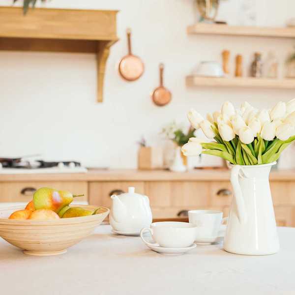
 Recommended for you
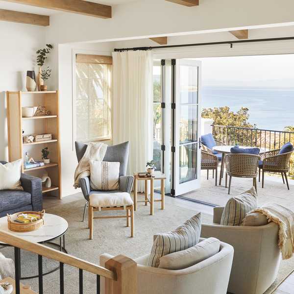
After years of playing it safe with cool whites and grays, color is officially making a major comeback in our homes. Of course, I will always love a trusty neutral to anchor a space, but this next wave of home color trends is all about self-expression and gorgeous contrast. Blues are back in a big way to bring calm and clarity, while playful pinks and fiery reds are popping up as the ultimate mood-boosting accents (and actually, I'm kind of obsessed with a blue-and-red combo!). Toss in some rich, espresso-colored hues for instant depth and warmth, and the result is a home that feels totally modern and on trend.
Here are 2026's biggest color trends for the home.
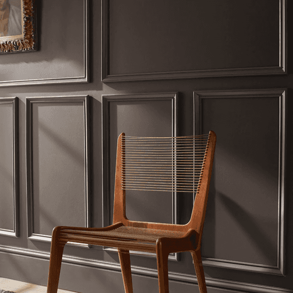
Elevated '70s
Dunn-Edwards
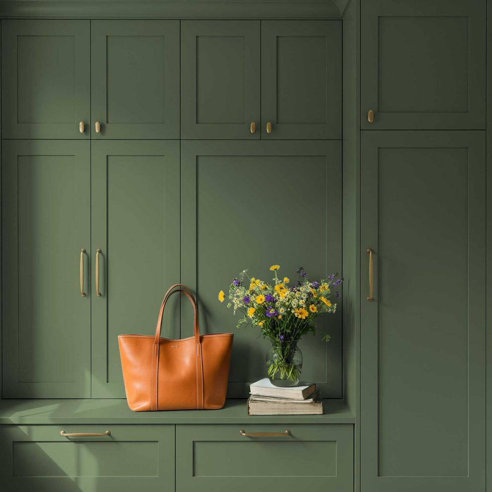
"The nostalgic warmth of 1970s interiors is making a strong return in 2026," says Lauren Hoferkamp at Dunn-Edwards, "but with a more refined, sophisticated perspective." If your nervous system is begging for a break from the daily grind, it’s time to let nature do the decorating. Earthy, soul-soothing hues like olive green, terracotta, ochre, and warm brown are dominating right now, creating gorgeous, grounded spaces that feel like a giant hug.
"Rather than the bold avocado greens and harvest golds of decades past, today's earth tones are softened, layered, and intentionally muted to create spaces that feel timeless rather than retro," adds Hoferkamp. Dunn-Edwards 2026 Color of the Year, Midnight Garden, a deep, muted green with earthy undertones, perfectly captures this evolution.
Bold & Unexpected
Dunn-Edwards
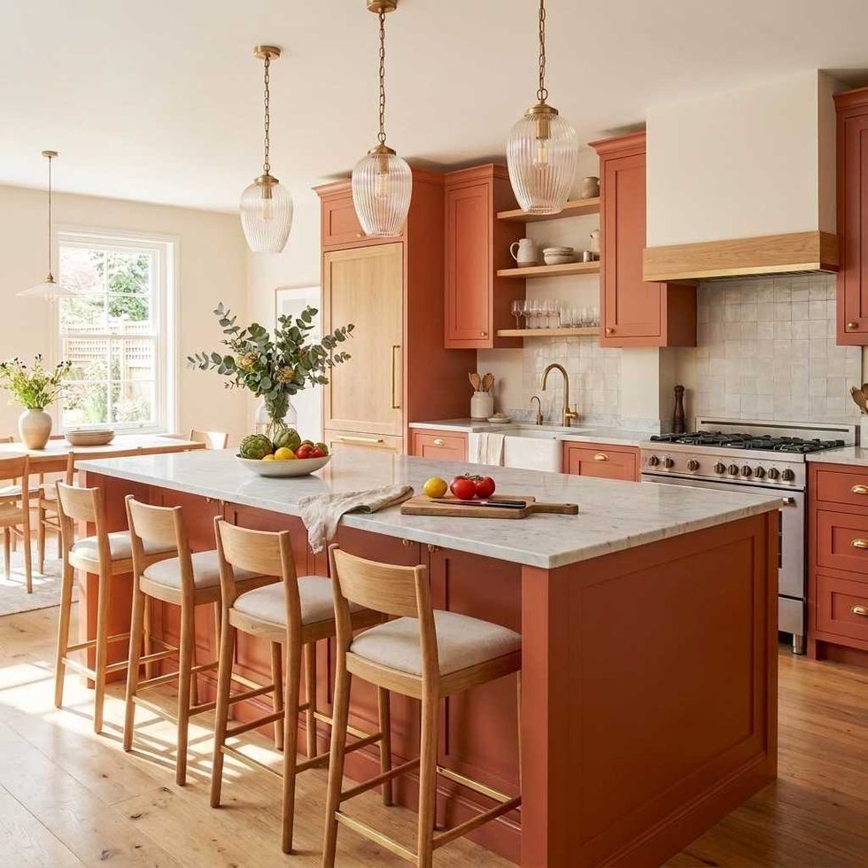
"Bold colors continue to gain popularity in 2026, but today's statement shades are far more sophisticated than the bright, saturated hues of previous decades," says Hoferkamp. "Instead of loud primaries, homeowners are embracing complex, earthy hues with subtle undertones that feel collected, intentional, and enduring."
If you're looking to add some major personality to your space without going totally overboard, Cedar Grove by Dunn-Edwards is about to be your new color crush. It’s a gorgeous, rich blend of burnt coral and terracotta that channels sunbaked clay and cozy, weathered cedar vibes. Because it’s slightly muted, it brings all the warmth and depth you want without feeling too loud.
Glidden’s Color of the Year, Warm Mahogany, is a similar shade we are loving. It’s the perfect mix of rich and restrained, bringing instant comfort, character, and creative energy to your space without totally taking over the room.
Warm Whites
Dunn-Edwards
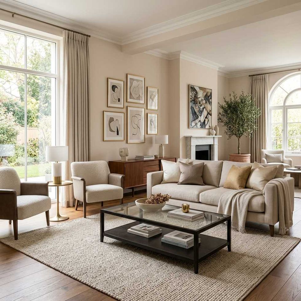
"Designers are gravitating toward creamy neutrals, mushroom tones, and soft taupes that create brighter spaces without sacrificing warmth and comfort," says Hoferkamp.
Dunn-Edwards Alabaster, a soft off-white paint with subtle beige undertones, creates inviting, livable spaces. "Its versatility allows it to serve as a whole-home neutral, a cabinetry color, or a backdrop for richer hues," adds Hoferkamp.
Color Drenching
Dunn-Edwards
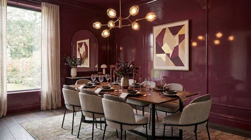
Color drenching means painting walls, trim, ceilings, and even millwork in one saturated color and we love it so much. It's bold, it's comforting, and it adds depth and character to a room.
"Dunn-Edwards Jazz Berry Jam is ideally suited for this dramatic approach," says Hoferkamp. Perfect for powder rooms, libraries, dining rooms, or home offices, this rich wine-inspired plum creates a vibe that feels luxurious, intimate, and inviting rather than dark or overpowering. Hoferkamp suggests going with a high gloss finish.
Earthy Reds
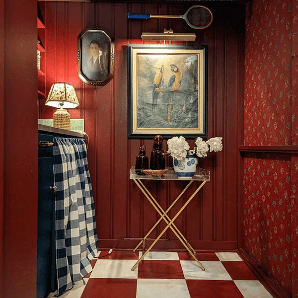
Clare Paint
If you’ve been waiting for a sign to make a bold move, 2026 is ushering in the super rare Year of the Fire Horse, and Feng Shui pros say red is the lucky shade to spark motivation, action, and exciting new beginnings. To keep that fiery, forward-moving energy feeling cozy rather than chaotic, use red as a powerful accent to lift the mood of any room. It's the ultimate confidence-booster! Start small with a playful pop of Clare Paint's Big Apple or Vintage hues.
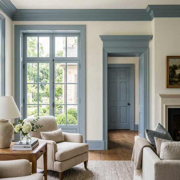
Contrast Trim
Dunn-Edwards
"White trim has long been the default choice in residential design, but 2026 is redefining how trim contributes to a room's personality," says Hoferkamp. "Rather than relying on stark white for contrast, designers are introducing softer, colored trim that adds depth, definition, and visual interest while complementing surrounding finishes."
Dunn-Edwards Country Air is a gentle sky blue, a color we're seeing everywhere in 2026. "Used on windows, doors, baseboards, or millwork, it frames architectural details with understated elegance while bringing a sense of intention and individuality to a space," adds Hoferkamp.
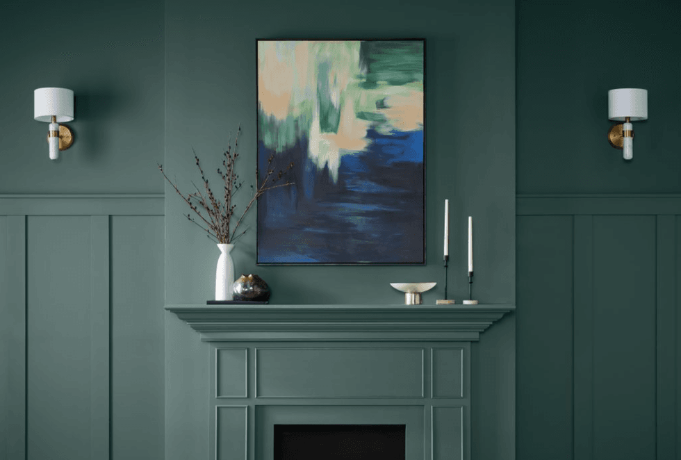
Gemstones
Behr
Gemstone colors are officially taking over 2026 walls, and we are absolutely here for the drama. Think rich ruby, grounding jade, dreamy amethyst, and moody sapphire. If you want to dip your toes into the trend, try Behr’s Color of the Year, Hidden Gem. It's a smoky jade that feels a little bit mysterious, a little bit retro, and completely sophisticated. It’s the perfect way to create an elevated, cozy space that feels like a chic, high-end hotel.
Coffee Browns
Benjamin Moore
With heritage styles making a major comeback, these neutral yet moody shades are having a serious moment. Inspired by the sharp look of tailored suiting, Benjamin Moore's Color of the Year, Silhouette AF-655, blends rich espresso tones with just a hint of charcoal. The result? A polished, grounded, and quietly luxe hue that brings instant depth, warmth, and effortless elegance to your space. (Pro tip: If you're on a DIY budget, Krylon's Color of the Year: Coffee Bean offers a super similar, equally dreamy vibe!)
Sherwin-Williams’ Universal Khaki SW 6150 is a lighter shade bringing serious latte-inspired warmth and trench-coat chicness to your walls. It's incredibly versatile, calming, and ready to elevate any room in an instant.
Pops of Pink
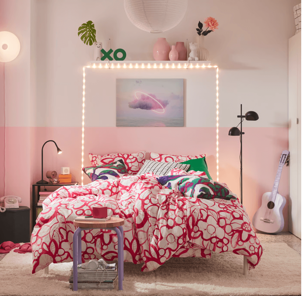
IKEA
Not everything needs to be perfectly neutral and refined. A pop of pink — whether you’re going for a soft, blushy vibe or a bold, statement-making moment — adds instant personality and a playful, romantic energy to bedrooms, dining rooms, and even home offices. Enter Rebel Pink, IKEA’s Color of 2026. This confident, fearless shade proves that standing out is officially the whole point. True to form, IKEA has delivered a hue that feels incredibly fresh, expressive, and ready to play.
Check out our online newsletter for more home decor inspo!
Brit + Co may at times use affiliate links to promote products sold by others, but always offers genuine editorial recommendations.